As we all know about the old interface of blogger. Today we shall discuss about new interface of blogger. There is a little bit difference between old and new interface. This post will mostly depend on images. We shall compare specially Stats and Comments tabs. We have already discussed Stats tab of old interface in blogger. Click here for old Stats tab. The new stats tab shows you many things in new way e.g followers, comments and posts etc. We can also check our traffic sources in a new way.
The object of this post is if a person who joins blogger today will also be provided with some basic knowledge of old and new interface. Some tabs are unchanged and some have changes. The specimen will be discussed with the help of images. While comparing old and new blogger all images in 1st position will show old blogger and 2nd image will show new blogger.
 |
| Comparison Between Old And New Interface Of Blogger |
There is a difference of shape, in old blogger it was in square shape but in new blogger it is in rectangular shape. Contents are same i.e Pageviews today, yesterday, last month and all time history.
This is the full overview of last week in the shape of a graph. You may select last 24 hours, month and all time overview.
Posts tab is shown like this in the old and new blogger. In the old blogger there you may see date too but in new blogger only the number of visitors is available. Rest of the things are completely same.
See the pages tab. There is merely a difference of look. In the new interface only the number of visitors is available but in the old blogger date is also available.
This is the only extra tab in new blogger which is not available in old blogger. Here you can see analytics of the last post.
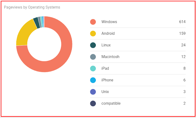
This is comparison between Audience Pageviews by Operating System. The difference is just in the old blogger it was in the form of percentage and number of pageviews while in the new blogger it is straight way a number of pageviews.
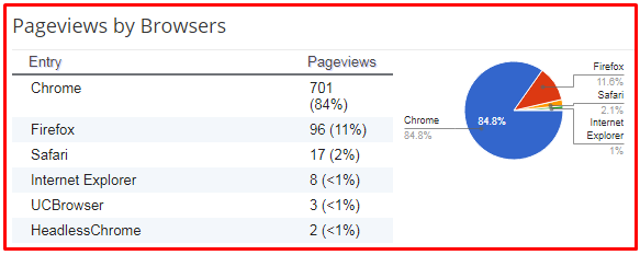
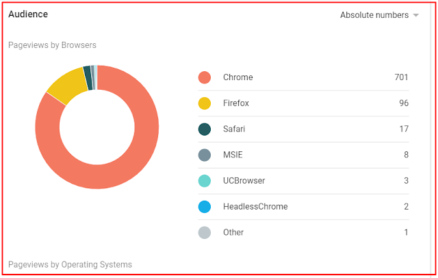
This is Audience tab by browser. Same difference as in by Operating System.
You may compare the old and new blogger yourselves. I think there is a difference of just the old was a small shape while the new is in large shape.
You may compare comments tabs. In the new blogger there is another visible change that you can go directly to your google analytics from here. MORE ON GOOGLE ANALYTICS tab will perform this action and you will be redirected to google analytics. This was the complete comparison between old and new interface of blogger.
Please share this post with your friends. Support this blog with your worthy comments through comments box. I shall be very grateful and thankful to you.


3 Comments
Am really impressed on the layout of your blog post and as ell as the information and teachings, so ell done.
ReplyDeletethank you very much.
DeleteThanks. you may mention mistakes. We shall consult you too.
ReplyDeleteI am very grateful and thankful to you for your worthy comments. Please do not tag spam links in comments.